
Fundamentals of Effective Visualization and Communication
Introduction
In data-driven decision-making world, effective visualization and communication of insights play a vital role in driving understanding, engagement, and action. Visualizing data in a clear and compelling manner enables stakeholders to grasp complex information quickly and make informed decisions. In this blog post we explore the fundamentals of an effective visualization and communication approach, along with real-life examples that showcase its impact.
Did you know? 69% of directors have fast-tracked digital business adoption.
Tailor visualizations to the audience
Adapting visualizations to the audience’s needs and preferences is essential. Consider an ecommerce organization sharing performance metrics with different stakeholders. While executives may prefer high-level summary dashboards with kpis such as sales, orders and revenue, operations team and marketing might benefit from detailed visualizations showcasing operational speed outcomes and CRM campaings effectiveness. By tailoring visualizations to specific user groups, the information becomes more relevant, engaging, and actionable. Three basic pillars of dashboards and visualizations are:
-
Strategic Dashboards: Provide a high-level overview of key performance indicators (KPIs) aligned with the organization’s strategic goals. They help executives and senior management track progress, identify trends, and make informed strategic decisions. Strategic dashboards often include summary charts, trend indicators, and visualizations that focus on long-term performance.
-
Operational Dashboards: Designed to monitor real-time or near-real-time operational data. They provide insights into ongoing processes, performance metrics, and operational efficiency. Operational dashboards are commonly used by managers and operational teams to identify bottlenecks, address issues promptly, and optimize day-to-day operations. These dashboards may include metrics such as sales performance, production rates, or customer service response times etc.
-
Analytical Dashboards: Used to explore and analyze data in detail. They offer interactive capabilities, allowing users to drill down, filter, and manipulate data to uncover insights. Analytical dashboards are commonly used not only by relevant business stakeholders but additonaly by data professionals to conduct in-depth analysis, identify patterns, and generate hypotheses. These dashboards often include various charts, tables, and filters to support data exploration.
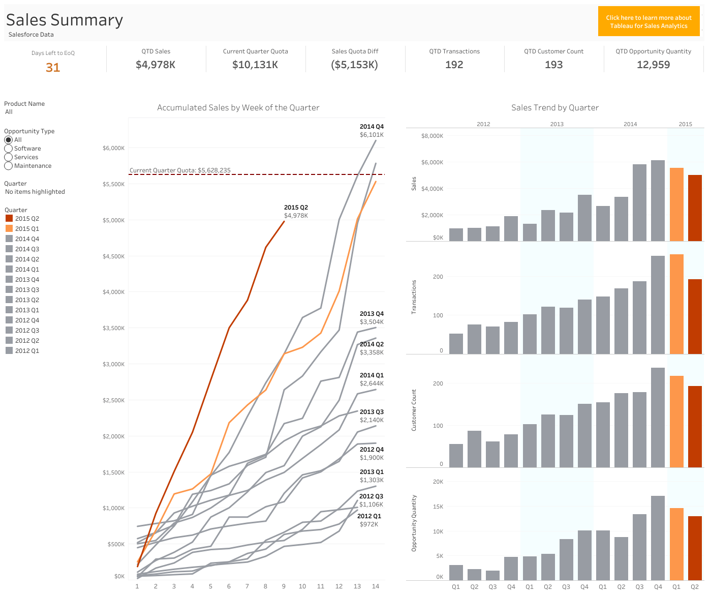
Why? With this report, sales executives can track quarter to date (QTD) sales performance, review numbers in relation to the current quota and previous quarters, filtered by product and opportunity type in this dashboard based on CRM data
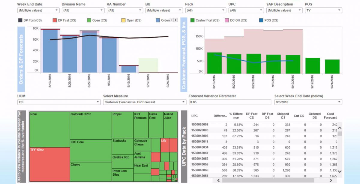
Why? Above dashboard analyzes inventory, logistical, and finance data from across the country. Bringing the data into an analytical dashboard allows stakeholders to make sense of big data and empowers analysts to create supply chain and forecasting reports in record time.
Choose the right visualization type
Selecting the appropriate visualization approach is crucial to convey insights effectively. For instance, a retail company analyzing sales performance across different states might use a geographic heat map instead of a simple barchart to highlight sales hotspots and identify areas for expansion. By visually representing sales data on a map, decision-makers can easily identify patterns and make targeted business decisions. In the example below it’s clear that the company makes the majority of sales in the south. Such kind of information is hidden in our case if we choose a barchart.
.png)
Tip This barchart highlights the top states by sales. Don’t focus on the visualization’s format (labels etc) but only in its type. The main idea here is that sometimes there are corellations behind data.
.png)
Tip In contrast with previous viz, we can now notice that sales are concentrated in the southeast regions. Perhaps this is something that the business may is aware of but imagine a scenario that you found something interesting.Blend your technical skills with analytical thinking and business knowledge.
Choose the right visualization tools
Selecting the right visualization tools can greatly enhance the effectiveness of data communication. From widely used tools like Tableau and Power BI to programming languages like Python with libraries such as Matplotlib and Seaborn, the choice depends on factors like data complexity, interactivity requirements, and the target audience’s familiarity with the tools. Understand the Data: Begin by thoroughly understanding the nature of your data. Consider its complexity, size, structure, and the relationships you want to highlight. Determine whether the data is numerical, categorical, time-series, spatial, or a combination of these.
Define Objectives and Audience: Clarify your objectives for data visualization. Are you aiming to explore patterns, present trends, compare data, or tell a compelling story? Additionally, identify your target audience and their familiarity with visualization tools. This information will guide you in selecting user-friendly options or more advanced tools.
Assess Data Interactivity Requirements: Evaluate whether your visualization needs to be interactive. Interactive visualizations allow users to explore and manipulate data, providing a more engaging experience. Consider if you require features like filtering, drill-down, zooming, or hover-over tooltips to enhance data exploration.
Consider Data Size and Performance: If you are dealing with large datasets, assess the performance capabilities of the visualization tools. Some tools may struggle to handle extensive data, resulting in slow rendering or potential crashes. Ensure the chosen tool can efficiently handle the volume of data you’re working with.
Evaluate Tool Capabilities: Research and compare the features and capabilities of different visualization tools. Consider factors such as chart types supported, customization options, data integration capabilities (e.g., connecting to databases or APIs), ease of use, learning curve, and community support.
Explore Pre-Built Solutions: Many visualization tools offer pre-built templates or dashboards tailored for specific industries or data types. Evaluate whether these ready-to-use solutions align with your requirements. They can significantly reduce development time and provide inspiration for your own visualizations.
Consider Data Source and Compatibility: Examine the data sources you’ll be working with and determine if the visualization tool can easily connect to and import data from those sources. Compatibility with popular file formats, databases, or data analysis platforms is important for a smooth workflow.
Evaluate Scalability and Deployment Options: Consider the scalability of the visualization tool. Will it support your future needs as your data grows? Additionally, assess the deployment options available. Some tools may offer cloud-based solutions, while others require on-premises installations.
Review Cost and Budget: Take into account the cost of the visualization tools and any associated licensing fees or subscriptions. Compare the pricing models and choose a tool that fits within your budget while meeting your requirements. Some tools offer free versions or open-source alternatives.
Seek User Feedback and Reviews: Look for reviews and feedback from users who have used the visualization tools you are considering. Their experiences and insights can provide valuable information about the tool’s strengths, weaknesses, and usability.
Did you know? More than 46% of businesses are already using a BI tool as a core part of their business strategy.
Simplify complexity
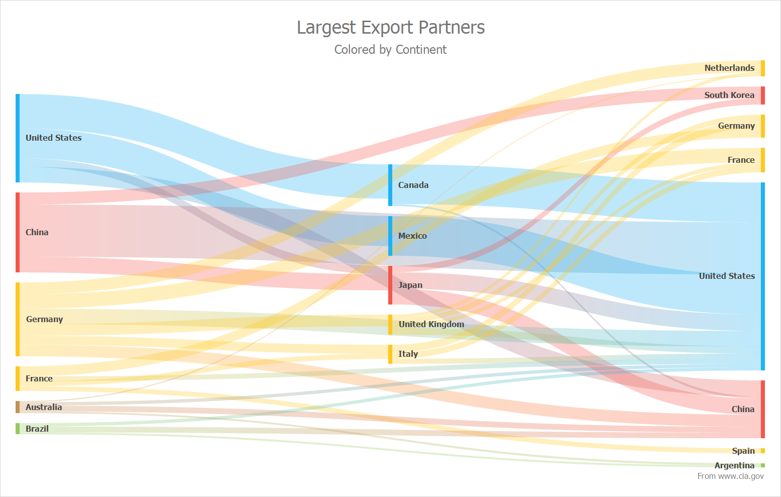
Simplifying complex data into intuitive visual representations enhances understanding. For example, a manufacturing company visualizing the amount of transportations per continent. We might use a sankey chart to depict the magnitude across different countries. By simplifying our complex dataset into one visualizatin senior managers can easily identify areas of concern and adjust their business strategies accordingly.
Did you know? 85% of business leaders agree that big data will significantly change the way that they do business.
Utilize interactive visualizations
Interactive visualizations allow stakeholders to explore data and derive insights based on their specific interests. A social media platform analyzing user engagement might provide interactive dashboards that enable marketers to filter and drill down into specific demographic segments, engagement metrics, or campaign performance. By enabling users to interact with the data, organizations empower stakeholders to make data-driven decisions in real-time.
Did you know? 56% of organizations that utilized analytics in 2020 reported faster and effective decision-making.
Contextualize data with annotations
Annotations provide additional context and guidance within visualizations. For instance, an e-commerce company analyzing website traffic might annotate significant events, such as marketing campaigns or website updates, on a line chart showcasing user visits.Stakeholders can correlate fluctuations in traffic with specific initiatives, enabling a deeper understanding of the impact of those events.By incorporating annotations into visualizations, you can add clarity, prevent misinterpretation, provide additional context, and guide the audience’s attention towards the most important aspects of the data. They are an effective means of enhancing understanding, promoting accurate interpretation, and facilitating meaningful communication of insights derived from the visualization.
Did you know? 70% of organizations think that data discovery and visualization are vital.
Visualize comparisons and trends
Visualizing comparisons and trends allows stakeholders to identify patterns and make data-informed decisions. For example, a manufacturing company comparing sales across different regions and product categories may use a line chart to display sales side by side. This visualization makes it easy to identify underperforming lines and take corrective actions to improve quality.
Did you know? 90% of sales and marketing teams cite BI as a crucial tool in getting their work done effectively.
Tell a story with data
Data storytelling involves presenting insights in a narrative format to captivate and engage stakeholders. Consider an environmental organization showcasing the impact of climate change. They could create a series of visualizations illustrating the rise in global temperatures, melting ice caps, and endangered species. By combining data visualizations with compelling narratives, the organization effectively communicates the urgency for action and mobilizes support. It’s easier to find an analyst writing some high quality pandas from finding someone who can make an impact by presenting a data story in a senior management meeting. Data storytelling is an important skill that becomes increasingly valuable as data analysts progress in seniority.
Communication and Influence: As a data analyst, you often need to present complex data and insights to diverse stakeholders, including executives, managers, and non-technical team members. Data storytelling allows you to effectively communicate the meaning and implications of the data in a compelling and accessible manner. By telling a cohesive and engaging story, you can capture attention, inspire action, and influence decision-making based on data-driven insights.
Bridging the Gap between Data and Decision-makers: Senior data analysts often serve as intermediaries between technical teams and business stakeholders. Data storytelling enables you to bridge the gap between these groups by translating technical findings into meaningful narratives that resonate with decision-makers. By presenting data in a context that decision-makers understand, you can help them make informed choices and build trust in the data analysis process.
Persuasion and Buy-in: Senior data analysts are frequently involved in driving data-driven initiatives and implementing changes within an organization. Data storytelling plays a crucial role in gaining buy-in from stakeholders, including executives and teams responsible for implementing recommended actions. By crafting a persuasive narrative, supported by relevant data, you can effectively communicate the rationale behind your recommendations and secure support for your proposed strategies.
Influence Organizational Culture: As an analyst, you have the opportunity to influence the organizational culture around data-driven decision-making. Data storytelling helps create a culture where data is not only understood but also valued and utilized. By presenting compelling narratives and consistently demonstrating the power of data in driving insights and outcomes, you can inspire others to embrace data-driven approaches and make it an integral part of the decision-making process.
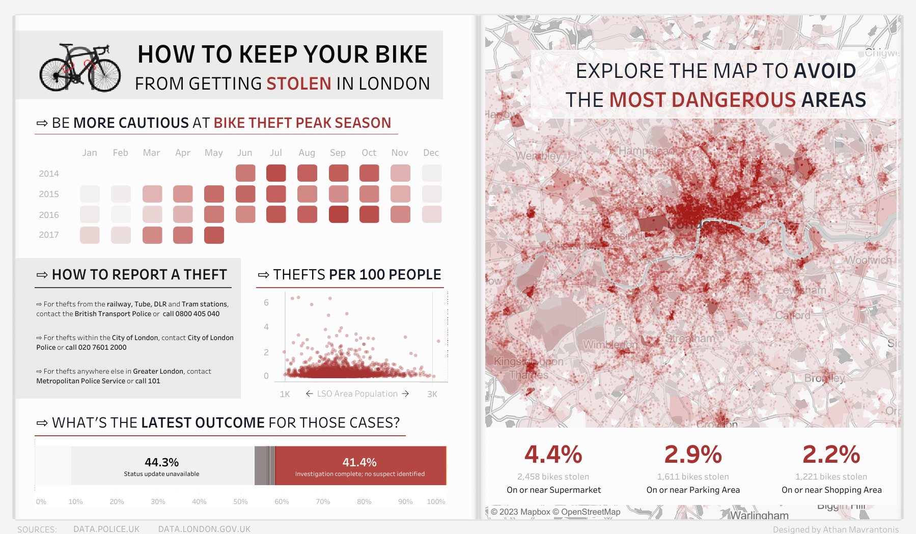
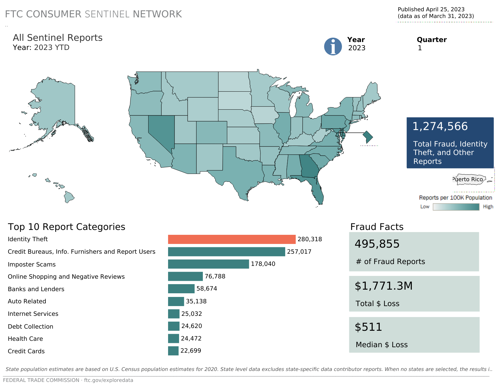
Did you know? When some students were asked to recall the speeches, only 5% remembered a statistic, but 63% remembered the stories. Take notice of the dashboard above (thanks to Athan Mavrantonis, link in references). It depicts hours/days of analyzing in an accelerated manner.
Conclusion
Effective visualization and communication of data insights are essential for driving understanding, engagement, and action. By choosing the right visualization approaches, tailoring visualizations to the audience, simplifying complexity, utilizing interactivity, telling data-driven stories, providing context through annotations, visualizing comparisons and trends, and leveraging appropriate tools, organizations can unlock the power of their data. By adopting these best practices, stakeholders can make more informed decisions, drive positive outcomes, and fuel business success.
References
-
How to Keep Your Bike From Getting Stolen in London by Athan Mavrantonis
- PepsiCo cuts analysis time by up to 90% with Tableau + Trifacta
- 7 Great Examples & Templates Of Sales Dashboards
- Sankey Diagram Control — A New Data Visualization
- Data Storytelling: How to Inspire & Convince with Data
Did you like the post? Empower me to dedicate more time and resources to curate, create, and share content that educates and inspires.
